One of my first tutorials on this blog was an article about the color wheel. The two techniques I'm going to babble about today are concerned with tints and shades. Just to make sure we're all on the same page, here are the definitions again:
Tint - when a color is desaturated by adding white, which makes it appear lighter. Pink is a tint of red.
Shade - when a color is desaturated by adding black, which makes it appear darker. Maroon is a shade of red.
A monochromatic palette is one in which only a single color and black and white are used. Think Picasso during his "Rose" and "Blue" periods.
Near-monochromatic pieces use primarily one color (and black and white), but also another color for either contrast or harmony. These techniques are extremely popular in Japanese pop art for some reason. Here are some examples by female manga artist group, CLAMP:


Note that in each picture, there is a single main color of focus: red, green, and yellow, respectively. Also note the sparing use of a second color (yellow) for harmony in the green picture; and the sparing use of a second color (blue) for contrast in the yellow picture. Otherwise, really the only other "colors" used in these are black and white. The artists rely on tints and shades to add values (shading) to these pieces.
The same can be done in jewelry work. Chances are, even if you've never heard of this theory or these techniques before, you've used them without realizing it.
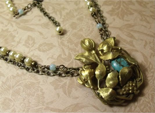
When I got this antique dress clip, the brass was so rich, I wanted to keep it the main focus. To further emphasize it, I needed to find something that would add a touch of contrast. The color wheel tutorial talks about near-complimentary colors:
Near-complementary colors - when a color is paired with the color that appears next to its compelementary color on the color wheel, creating slightly less visual tension. Blue and yellow-orange, for example, are near-complementary colors.
Brass is a yellow-orange metal, therefore blue-green is the perfect color to offset it; I chose turquoise, which is a blue-green stone. Then, in keeping with the idea of a near-monochromatic palette, I chose light golden pearls and light blue-green glass beads (both tints of the focal colors). I also tried to keep the proportions of yellow-to-blue the same throughout the rest of the necklace.
Here are some more jewelry pieces that artisans on etsy made
using monochromatic or near-monochromatic theory:

by doozydoo


by Shannon
----- ----- -----
So now I'd like to challenge you to sit down at your beading table with these theories and techniques in mind and create a piece or two. Or, if you already have, to share them on your blog. Don't forget to leave a comment here so that I know and can check it out!
And, as always, happy beading. <3
----- ----- -----
3 comments:
I love what you did with brass clip. It looks gorgeous with the turquoise peaking through. Color is so interesting whether it involves complementing colors or contrasting. White and black are so extreme to work with since it really does change the look of the other beads you are working with! Have a great 4th of July! ~Val
That brass clip necklace is amazing!
I was just reading that you tried the eggplant parmesan! It is so delicious! We did not pick up anything in the antique shop in Newburyport. I love browsing but do not really collect things. I feel like I have enough clutter already at home! Have a great week! ~Val
Post a Comment