Showing posts with label tutorials. Show all posts

Friday, July 1, 2011

A tintch of color theory...

Working with color can be tricky for even the most seasoned painter. But how about jewelry makers? Most beaders I've met have no fear of mixing and matching some of the most fun color combinations. This is fantastic and I think other kinds of artists can learn a thing or two from them. Nevertheless, I want to share a little bit of color theory that might be a new way to play with color for some jewelry makers; it might be just a refresher for others, or it may allow some folks to put names to techniques they've been using for a long time without ever realizing it!

One of my first tutorials on this blog was an article about the color wheel. The two techniques I'm going to babble about today are concerned with tints and shades. Just to make sure we're all on the same page, here are the definitions again:

Tint - when a color is desaturated by adding white, which makes it appear lighter. Pink is a tint of red.

Shade - when a color is desaturated by adding black, which makes it appear darker. Maroon is a shade of red.

 A monochromatic palette is one in which only a single color and black and white are used. Think Picasso during his "Rose" and "Blue" periods.

Near-monochromatic pieces use primarily one color (and black and white), but also another color for either contrast or harmony. These techniques are extremely popular in Japanese pop art for some reason. Here are some examples by female manga artist group, CLAMP:


Note that in each picture, there is a single main color of focus: red, green, and yellow, respectively. Also note the sparing use of a second color (yellow) for harmony in the green picture; and the sparing use of a second color (blue) for contrast in the yellow picture. Otherwise, really the only other "colors" used in these are black and white. The artists rely on tints and shades to add values (shading) to these pieces.

The same can be done in jewelry work. Chances are, even if you've never heard of this theory or these techniques before, you've used them without realizing it.
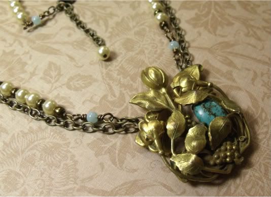

When I got this antique dress clip, the brass was so rich, I wanted to keep it the main focus. To further emphasize it, I needed to find something that would add a touch of contrast. The color wheel tutorial talks about near-complimentary colors:

Near-complementary colors - when a color is paired with the color that appears next to its compelementary color on the color wheel, creating slightly less visual tension. Blue and yellow-orange, for example, are near-complementary colors.

Brass is a yellow-orange metal, therefore blue-green is the perfect color to offset it; I chose turquoise, which is a blue-green stone. Then, in keeping with the idea of a near-monochromatic palette, I chose light golden pearls and light blue-green glass beads (both tints of the focal colors). I also tried to keep the proportions of yellow-to-blue the same throughout the rest of the necklace.

Here are some more jewelry pieces that artisans on etsy made
using monochromatic or near-monochromatic theory:


by Shannon


So now I'd like to challenge you to sit down at your beading table with these theories and techniques in mind and create a piece or two. Or, if you already have, to share them on your blog. Don't forget to leave a comment here so that I know and can check it out!

And, as always, happy beading. <3


----- ----- -----

Tuesday, June 7, 2011

ViaU! Tips for Photographing Silver Jewelry

Jewelry can be so difficult to photograph well, something Etsy and jewelry blogs everywhere can attest to. I know I still have LOTS of room for improvement. So I wanted to share this fantastic article with all of you. While the article focuses on silver, really, the technique can be used to better photograph any kind of jewelry. All you really need is pieces of cardboard and some tin foil. I'm going to try it the next chance I get!


(And, if you haven't seen it yet, I've been compiling a list of helpful articles and tutorials here. Feel free to check it out for more tips and tricks!)


And, just so this is not a text-only post, here's a necklace I don't think I've shared with you yet:


Ah! I almost forgot---this Saturday is also the new reveal date for the mid-monthly challenge hop!

So exciting!!!


----- ----- -----

Tuesday, January 18, 2011

Tutorial: Faux scrimshaw pendants, part II

Part I of this tutorial can be found here.

In the first part, I mentioned there were two ways to create the "carving" on a faux scrimshaw piece. The method we covered in part I was working with unbaked clay. The second method you could use is to prebake a blank piece, and then actually carve into the hardened clay to create the picture. This method requires a slightly sharper implement, but you can better control the depth of the cut. You can also sketch out your design in pencil before you make your carving, then erase all the lines for a clean finish. The only downside to this method is that, if you make a mistake, it is much more difficult to correct than it would be in soft clay. The carving comes out much finer in hard clay.


Part II: Painting your "Scrimshaw"


Materials:

- Acrylic paints

- VERY FINE grit sandpaper (not shown)

- Paper towels (important!!!) and brushes

- Water

- Drop sheet (you can use your parchment paper from part I)

- Paint-on polymer clay glaze or spray-on polyurethane (to seal)


How-To Process

After your baked piece has COMPLETELY cooled, rub the very fine grit sandpaper over the surface you are going to be painting. This will rough it up just a tiny bit so that the paint will stick. Use a mask and goggles if necessary.
When bone and ivory age, they become splotchy and yellowish like old paper. That's because they are made from hard natural fibers that are affected by environmental conditions. They also become smooth and shiny with handling. Keep these things in mind as you get set to paint your pieces.

To recreate the look of aged ivory, choose a golden ochre paint. If you don't have a premade paint, simply mix some brown into yellow on a separate container or surface. Do not bother with brushes at this point; just use a paper towel to dab generous amounts of the paint onto the piece's surface. Move the towel in swirls on the surface to make sure that paint gets into all the crevices of your "carving". Wipe any excess off. 

Now, take a brown or dark brown paint and dab it onto just the "carved" sections of the piece. Do exactly as before: move the towel in swirls over the piece to make sure that the paint is sticking in the crevices of the picture. Wipe the excess off with a VERY LIGHTLY damp towel. You may repeat this process again and again until you are satisfied with the effect. If your piece gets too dark, feel free to repaint it from the beginning, using the ochre paint again.

The piece at this point will look pretty manufactured, so we will further distress it and add some little details to make it more realistic.

You may use a dry brush to add some white to certain sections, being very careful not to let the white get into the carvings. You may also wait until the piece is dry and use the same piece of very fine sandpaper to rough up parts of the painted surface, just pulling off enough of the paint to make it shiny and lighter. Repeat the process with the brown paint above until you have a piece that looks suitably old and worn with handling. (Compare the picture on the right to the one above it!)


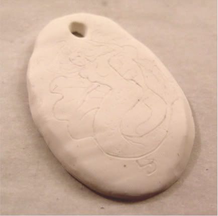
Here's a picture of the two sample pieces I made, one painted and the other not, 
just to showcase the lovely transformation.


We are going to repeat the exact same process to paint the piece we carved after baking.


Ochre paint (mixed with a little white this time) dabbed on with a paper towel and then wiped off again.


Brown paint dabbed on and rubbed off again a few times, allowed to dry, and then roughed up with the sandpaper. Note the roughed-up and finely worn edges; this process is perfect for emphasizing carved edges. Be sure to get inside the hole at the top of the pendant where the cord or beading wire will go through.

* Design option: You may use other colors of paint to add a tint to sections of your piece; for example, a watered-down blue or green for water. Just try to make it thin so that the "natural" ivory color will show through.


The last part of this process is sealing the pendants. When the paint is completely dry, you may turn the pendant over and paint the back black or ochre and brown to match the front. However, you must wait until that surface is completely dry before sealing the piece.

I used Sculpey glaze, but you may use a spray-on sealant instead. The benefit to using the glaze is that you can manipulate it so that it mimicks the natural fibers of bone by using a brush to put a generous amount of glaze on the surface, then drawing the brush repeatedly in the same direction across the surface to leave minute ridges in the glaze. Let the pieces dry in a well-ventilated area for 24 hours or according to the directions on the glaze/sealant packaging.


These would make great additions to historical costumes or the perfect gift for a pirate-lover. :D

Thanks, and hope you enjoyed this!
Let me know if you make your own; I'd love LOVE to see them!


--- --- --- --- ---

Saturday, January 15, 2011

Tutorial: Make faux scrimshaw pendants

"Scrimshaw" was the name given to amateur artforms practiced by sailors on long ocean voyages, usually on whaling hunts. It most commonly refers to carved bone, usually the teeth or other bones harvested from slain whales.

Today there are many restrictions on the use of ivory, even in the most prestigious of arts; this is understandable, since the material requires the death of living animals that share this earth with us. Many of these are endangered species because of centuries of hunting for their bones, teeth, and tusks. We do not want to encourage the killing of these animals or the trading of their parts, so instead we will use polymer clay and some other materials to recreate the look of aged scrimshaw.


Part I - Making Your Scrimshaw

Materials

- Polymer clay (I used FIMO here, but any kind would work), in white, ivory, pearl, or any variation of off-white color. (I used white here.)

- Some kind of sharp tool. I used an awl, but a mechanical pencil, toothpick, pin, or needle would also work.

- Rolling pin or noodle-style press.

- Parchment paper, two sheets.

- Cookie cutters. (It is advised that your tools for polymer clay are not to be used for food preparation.)


How-To Process

 Roll the clay around in your hands until it is warm and pliable. Form it into a rough ball and place it on one piece of parchment paper. Flatten it slightly and place the other piece of parchment paper on top of the flattened clay. Use your rolling pin to thin and further flatten the clay.

If you are using a noodle-style roller press for your clay, roll it until it is approximately a millimeter or two thin.


You do not want your clay to be too thin, because otherwise it may break easily. Flip the clay by simply taking the corners of the parchment paper and turning it over with the clay inside so you can roll the other side. You can peel the paper apart to check on your progress and determine your clay's thickness. This looks pretty good. Just drop the paper back down if it needs to be rolled more.


When the clay is at the desired thickness, use your cutters to make shapes in it. Be sure to press down and twist to make sure the cut piece is released from the rest on all sides. You may be able to get more than one shape from your bit of clay. Just collect the left overs and reroll it and recut it until you have as many pieces as you want or as many as you can make at one time with what you have.


Twirl and brush your sharp implement along the edges of the pieces to give them a beveled, carved look. This will make the piece look more finished. Also used this tool in small swirls to make a hole near (but not too near!) to one of the pendant's edges. This is how you will be able to string the piece.


This pendant is an antique heirloom that really was carved from ivory. However, from the size and shape of the piece, I would venture a guess that it is probably made from a repurposed slice of ivory from an old piano key.

It displays one of the most popular subjects of scrimshaw carvings: a ship. Other popular subjects were historical events (such as important voyages), portraits, commemorative emblems, coats of arms, and sea creatures (such as whales and narwhals) and mythical creatures (such as mermaids).

To get inspiration, just go on Google Images and do a search for "scrimshaw".

For our two experimental pieces, I chose to do a ship and a mermaid.


 The first method we'll cover is using soft clay before it is fired.

Use your sharp tool to lightly draw the outlines of the "carving" you want to make in your pendant. Feel free to add embellishments and simple cross-hatch style shading and details. You don't have to go too deep at all; just enough to make a crevace where the paint will catch later.


Take your pen or pointy tool and roll it gently over the top of the drawing the entire length of the piece to slightly rub out your "carving". Now, this might not make much sense at this time but trust me, it will add much to the finished piece. It will make it look worn with age and polishing.


Just before you are ready to bake the piece, check to see if there are areas that could use some reinforcement. This piece was a little too thin on top above the hole; I strengthened it by adding a little piece of clay to the back and rubbing lightly with my sharpened tool to get a good bond. Don't be too terribly worried about the back, since it is not what people will see and can be covered by paint later. The entire piece will be glazed at the end for added strength and durability.


Add any last touches you want. I had a space at the bottom of my piece, so I added "1794"---the year the United States Navy was officially formed. :)

When you are happy with the design, bake the pieces following the instructions on the polymer clay packaging and allow them to cool completely before going on to the next step.


------ ----- -----

Monday, December 20, 2010

Solstice Moon and Thoughts on Photography

Tonight, for the first time since the 1638, there will be a complete lunar eclipse that will coincide with the winter solstice. It begins around 1 a.m. EST, for anyone interested in watching.


Does anyone else read Jewelry Affaire? I have a near-photographic memory, so when I saw the piece on the cover when I got my copy, I felt like I'd seen it before. Going back through my other magazines, sure enough I found it in an issue of another mag from over the summer; looks like it slipped through the cracks. XD Oh, well. It's a beautiful piece.

Today I found some lens pads and a cleaning cloth for my camera. I've been looking everywhere! And you know where I finally found them? In a vision store for glasses and contact lenses. In the future, that's where I'm going first. There aren't really any camera stores around us and none of the electronics stores seemed to have anything like what we needed. What's nice about the pads is that they can be used on computer screens and other electronic equipment like that, as well as on glasses. Gotta love multi-taskers!

Speaking of camera lenses, that reminds me of this web site I ran across today: Joseph Rossbach's Photography Tips. His work is wonderful. And, while he uses Adobe Photoshop and I use the free program GIMP, I learned a lot from his videos.


These techniques are also useful in photographing jewelry. I've already redone several of my darker and unclear pictures. My work on learning the technical stuff of grammar and linguistics continues as well. You are never too old to learn! Is it sad that I spend my vacations this way? XD


----- ----- -----

Saturday, October 9, 2010

A Note on Texture

There's two kinds of texture in any kind of artwork: actual texture, and visual or implied texture. Actual texture is the physical surface and shape of things---in painting, an example would be the artist's use of sand in the paint or really thick brushstrokes that leave a risen, dappled surface on the canvas; another example might be the artist's use of an unorthodox shaped canvas (such as triangular; or no canvas at all, as in the case of painted saw blades or sculptures). Visual or implied texture is the illusion of texture---an example in painting would be the depiction of clouds or ripples in fabric, when such things are actually only visually recreated on a two dimensional surface via different uses of techniques. Does this make sense?

In beading, there are hundreds of ways to add texture to a piece! Beads come in a variety of shapes and textures. There are faceted beads, stick beads, square and star shaped beads, beads with a carved surface, beads created out of rolls of paper or wire wrapped around an object, some with raised surfaces, etc. etc. etc. Endless! But beads can also have implied or visual texture. Think of beads with beautiful swirls in the glass, or mother-of-pearl beads with ripples of iridescent glow on an otherwise flat plane, or fire-polished agates, with their smooth yet crackled surface.


Sometimes it's the beads you pair together that create the texture. Square beads with spears of different kinds of stone will create an earthy, almost primitive-feeling effect. Round beads paired with ornate bead caps can add a very elegant texture to an otherwise plain pearl necklace. Fun shaped spacers can spruce up any piece! Even playing with size, pairing up very large round beads with really small ones, or entwining different sized chain together, can alter texture in a plethora of delightful ways.

So, the next time you're sitting down to design, let texture be a conscious part of your considerations. You won't be sorry! :)


----- ----- -----

Monday, September 20, 2010

Color Workshop

There was an article regarding color and color combinations in one of the top beading magazines recently. As an art student, this is one of those things I had to study from the beginning. There were some things that were left out of that article, and some things that were not perfectly clear, so I'd like to offer some further information about it here.

This is that ancient tool of artists everywhere, the color wheel.


The thick, solid lines connect the three primary colors: red, blue, and yellow. These are the colors that cannot be made by mixing any other colors. The colors connected by dotted lines are secondary colors: green, orange, and violet. These colors are made by mixing different combinations of the primary colors together (i.e. blue and yellow, yellow and red, and red and blue, respectively). Those colors between these two triangles on the circle are called tertiary colors, and they are made by mixing primary colors with secondary colors (for example, yellow-orange is made by mixing primary color yellow with secondary color orange). Neutral colors are white, black, gray (a mixture of white and black), and brown.

Groupings of three colors that appear side-by-side on the color wheel are called analogous colors (blue, blue-green, and green, for example). These color combinations are perfectly harmonious together and often lend a soothing palette to any design. Colors that are connected through the center of the circle via a gray line are complementary colors, or visual opposites. Red and green are complementary colors, for example. A near-complementary color combination is one in which a color is paired with the one that appears next to its complementary color (for example, violet and yellow-orange). These are great combinations that lack a little of the visual tension created by pairing complementary colors, creating a slightly more harmonized design.

As noted above, when paired in equal amounts, complementary colors create an apparent discord; they seem to be in competition with each other and make each other appear more saturated than they would if they were viewed apart. However, when complementary colors are mixed out of proportion, they can offset each other in a visually pleasing way through contrast, as red ornaments placed conservatively can make an evergreen tree appear more beautiful. Another trick is to use one saturated color and then a desaturated (tint or shade) of a complementary color to offset it.

Tints and shades should not be confused with hues. A hue is an unadulterated (pure) color in its saturated form. A tint is a color that has been desaturated by adding white to make it appear lighter. Conversely, a shade has been desaturated by adding black to make it appear darker.


To further illustrate saturation, consider the following three versions of the same picture. The one on the top has been desaturated; the one in the center appears in its original form; the bottom one has had its saturation increased through a computer imaging program.

(Desaturated)
(Original)
(Super-saturated)

Note how in the super-saturated version, all the colors appear brighter, but in the less-saturated version, they appear more gray but the lightness and contrast of the original has been maintained.

Now, how to bring all this knowledge into your designs?

Primary colors - saturated hues that cannot be made by mixing any other colors together. Red, blue, and yellow are the primary colors.

Secondary colors - saturated hues made by mixing two primary colors together. Green, orange, and violet are secondary colors.

Tertiary colors - saturated hues made by mixing a primary color with a secondary color. Yellow-green, red-orange, red-violet, blue-violet, and blue-green are all tertiary colors.

Neutral colors - white, black, gray (a mixture of white and black), and brown.

Analogous colors - colors that appear next to each other on the color wheel, and which act harmoniously together. Blue, blue-green, and green are analogous colors.

Complementary colors - visual opposites that appear directly across from each other on the color wheel. Red and green, blue and orange, and yellow and violet are the main complementary colors. When mixed in equal proportions, complementary colors create a visual tension.

Near-complementary colors - when a color is paired with the color that appears next to its compelementary color on the color wheel, creating slightly less visual tension. Blue and yellow-orange, for example, are near-complementary colors.

Tint - when a color is desaturated by adding white, which makes it appear lighter. Pink is a tint of red.

Shade - when a color is desaturated by adding black, which makes it appear darker. Maroon is a shade of red.

In jewelry-making, there is plenty of room for play with colors. Think of amazonite as a tint of blue. What would go well with it? If blue's complement is orange, how about copper (an orange metal) to offset it? Other blues and some greens would be analogous, so how about some turquois and blue lace agate to harmonize? The possibilities are virtually (and visibly) endless!


----- ----- -----

Thursday, September 16, 2010

Project: Make a Beader's Friend!

You know how it goes, especially you bead weavers out there. Those long hours of sitting, hunched over a table, your fingers twisted around strings and needles, your eyes burning with the amount of light and concentration required to do this sort of work. And it doesn't matter how much you love it; "it" does not love your neck or back, your muscles or your eyes.

There can be some relief, however! It can be found in a small, hot poultice resting against the back of your neck. My sister taught me how to make these, and I don't know where I'd be without mine! It's really easy to make one for yourself, and you won't believe how nice it feels on your sore, work-worn muscles.

All you need is the following...


1-2 cups of dry, uncooked rice, any kind
1 CLEAN, hardly worn ankle sock (you don't want one with holes in it or thin spots; the sock I used I only ever wore twice, so I didn't feel too bad parting with it.)
1 tablespoon dried herbs or flowers or loose leaf tea or two tea bags (optional)

The more rice you use in your sock, the thicker and firmer it will be. I prefer mine with a little less rice because it tends to stay in place easier. If you want some nice aromatics, pour your rice into a big bowl and add a tablespoon of dried herbs, flowers, or loose leaf tea, or tear open two tea bags and dump the contents in (I used a green tea and lemongrass blend here!). Mix it all up with your hands, then use a spouted measuring cup to help pour the rice into your sock. Tie the ankle off, and you're done!

Here is a finished one made with a toe-sock:


To warm your poultice, place it in the microwave for 45 seconds to a minute. Be careful taking it out, as it could be very hot! You might want to wait a minute or two before applying the poultice. You can drape it over the back of your neck, lie down and place it on your forehead or over your closed eyes, sit on the couch and place it between your lower back and the cushions. It will soothe any bead (or any craft) worn muscles!

This is a great way to use up mismatched socks. If you don't have a mismatched sock, and you don't know what to do with the second one, make two! Place the second one in your freezer in case you ever need a cold pack for anything.

Hope this proves helpful!


----- ----- -----

Saturday, August 21, 2010

Free tutorial: Make your own headpins!

Making your own headpins is not only economical in these hard times, it's also design-savvy because you can make them to fit the look and style of your own jewelry work. This tutorial will show you three basic styles of headpin that you can make very easily using a small number of tools and wire that you have on hand. Some of you folks probably already know how to make these headpins, but the web is wide and this guide might prove helpful to others out there. I hope that is the case!


 What you will need:

* Wire. You'll want to use a gauge that will fit your beads, but you'll also want the wire to be of a good thickness so that it will be sturdy enough to support your beads as well. Today I am using dead soft 20 gauge wire. It's large enough that you can see what I'm doing, but small enough to fit through bead holes without having to resort to a reamer.

* Round-nose or round needle-nose pliers, one set.

* Clippers to cut your wire.

* Beads, preferrably with holes large enough for your wire to fit through. If your beads have larger holes, you can either make adjustments with your headpin or add a second bead. More on this later.


I am using generous lengths of wire today so that my fingers don't get in the way of what I'm trying to show you. The nice thing about making your own headpins is that you can make them any length you want. I recommend practicing on longer lengths of cheaper wire, then you can move on to finer metals.

Take the wire in your finger and hold it while grasping as close to the other end with your pliers as you can.


Use your fingers to gently pull the wire toward you while holding the end firmly with your pliers. This will create a half loop on the end of the wire.


 Take the half loop in your pliers again and gently rotate the wire end back toward itself to complete the loop. This is your first headpin. You can add your bead and make a loop on the other end, after you've trimmed it to size, and link many together. Or you can add a bead or focal to dangle, as in earrings or for the centerpiece of a necklace.


Or you can go on to make a second style of headpin by using the base of your pliers to squeeze the loop together.


You have completed a second style of headpin!


If you want a more whimsical look for your jewelry, there is a third style of headpin we can show you how to make. The first few steps in making this headpin remain the same as the first two headpins; it's how you finish it that changes the look.


This time we're using a gold-colored wire. It is also 20 gauge and dead soft wire. Follow the first two steps above but don't squeeze the loop together.


Take the wire in the flat part at the base of your pliers (or you can use a pair of regular needle-nose pliers for this step) and gently rotate the wire toward itself using your fingers while holding the loop steady. You will begin to see that you are creating a swirl with the wire. You can repeat this step until the swirl is as large as you require.


This style of headpin is great for beads with larger holes because you have complete control over how large your swirl will be. It lends a playful, whimsical look to your project for sure! It can add a mystical feel as well, since it resembles an old Celtic symbol of infinity.


You now know how to make three different styles of headpins. Simply straighten your wires, add your beads, and you're good to go! Or you can lightly hammer the ends for added strength and durability. When you've put your beads on your pins, you can also choose to fold the ends up against the bead or leave them as they are.


Nothing says "this is handmade jewelry" like handmade headpins!


Hope this guide is helpful! Happy beading. :)


----- ----- -----