Patty's on my bead table this week. ;D Pictures and updates soon to follow!!
<3
----- ----- -----

Wednesday, July 6, 2011


Tuesday, July 5, 2011
Wanted: Project Pals

When I got them home, I dove right in without waiting. How fascinating! It begins with a mysterious hand-illustrated card from one artist to another with an outrageous claim: "I can see what you see." From there the story unfolds as the two get to know each other intimately through this long-distance correspondence. The entire thing is told through pictures and letters. Because of the nature of its media, it has been described as a "pop-up book for adults." Think Pirateology, Dragonology, Wizardology... but with a beautifully rich plot in place of informational text.
I want to try something similar for the month of August. However, instead of beautifully illustrated cards and letters, I was thinking handmade jewelry and photography. It would involve making a piece, writing a letter, and (though optionally for this) taking pictures for each week of August. This would come out to four posts in total---not TOO demanding, but at the same time a nice little challenge.
The letters can be written about anything; the inspiration behind the piece, thoughts for that time of year, commentary on activities, philosophy, art, reminiscences, etc. etc. etc. The pieces can be made with anything from the partners' respective stashes, but after the first week they MUST be a response to their partner's piece from the week before. In this way, each person will be setting the stage and overall feeling of the entire project through the first pieces. All materials for the week will be posted on the participants' respective blogs on a fixed day of the week (Thursday, for example). Partners may comment on each others' blog posts, but should really use their letter for the next week to respond. I am also considering a bead swap as part of the project.
I think this would be interesting. At first I was going to put up a wanted notice for just a partner for myself, but if other people are interested, they are also welcome to join. Note that I am talking about August---I'm actually planning ahead this time! XD
So, comment here if you're interested in participating!
----- ----- -----
Friday, July 1, 2011
A tintch of color theory...
Working with color can be tricky for even the most seasoned painter. But how about jewelry makers? Most beaders I've met have no fear of mixing and matching some of the most fun color combinations. This is fantastic and I think other kinds of artists can learn a thing or two from them. Nevertheless, I want to share a little bit of color theory that might be a new way to play with color for some jewelry makers; it might be just a refresher for others, or it may allow some folks to put names to techniques they've been using for a long time without ever realizing it!
One of my first tutorials on this blog was an article about the color wheel. The two techniques I'm going to babble about today are concerned with tints and shades. Just to make sure we're all on the same page, here are the definitions again:
Tint - when a color is desaturated by adding white, which makes it appear lighter. Pink is a tint of red.
Shade - when a color is desaturated by adding black, which makes it appear darker. Maroon is a shade of red.
A monochromatic palette is one in which only a single color and black and white are used. Think Picasso during his "Rose" and "Blue" periods.
Near-monochromatic pieces use primarily one color (and black and white), but also another color for either contrast or harmony. These techniques are extremely popular in Japanese pop art for some reason. Here are some examples by female manga artist group, CLAMP:


Note that in each picture, there is a single main color of focus: red, green, and yellow, respectively. Also note the sparing use of a second color (yellow) for harmony in the green picture; and the sparing use of a second color (blue) for contrast in the yellow picture. Otherwise, really the only other "colors" used in these are black and white. The artists rely on tints and shades to add values (shading) to these pieces.
The same can be done in jewelry work. Chances are, even if you've never heard of this theory or these techniques before, you've used them without realizing it.

When I got this antique dress clip, the brass was so rich, I wanted to keep it the main focus. To further emphasize it, I needed to find something that would add a touch of contrast. The color wheel tutorial talks about near-complimentary colors:
Near-complementary colors - when a color is paired with the color that appears next to its compelementary color on the color wheel, creating slightly less visual tension. Blue and yellow-orange, for example, are near-complementary colors.
Brass is a yellow-orange metal, therefore blue-green is the perfect color to offset it; I chose turquoise, which is a blue-green stone. Then, in keeping with the idea of a near-monochromatic palette, I chose light golden pearls and light blue-green glass beads (both tints of the focal colors). I also tried to keep the proportions of yellow-to-blue the same throughout the rest of the necklace.


One of my first tutorials on this blog was an article about the color wheel. The two techniques I'm going to babble about today are concerned with tints and shades. Just to make sure we're all on the same page, here are the definitions again:
Tint - when a color is desaturated by adding white, which makes it appear lighter. Pink is a tint of red.
Shade - when a color is desaturated by adding black, which makes it appear darker. Maroon is a shade of red.
A monochromatic palette is one in which only a single color and black and white are used. Think Picasso during his "Rose" and "Blue" periods.
Near-monochromatic pieces use primarily one color (and black and white), but also another color for either contrast or harmony. These techniques are extremely popular in Japanese pop art for some reason. Here are some examples by female manga artist group, CLAMP:


Note that in each picture, there is a single main color of focus: red, green, and yellow, respectively. Also note the sparing use of a second color (yellow) for harmony in the green picture; and the sparing use of a second color (blue) for contrast in the yellow picture. Otherwise, really the only other "colors" used in these are black and white. The artists rely on tints and shades to add values (shading) to these pieces.
The same can be done in jewelry work. Chances are, even if you've never heard of this theory or these techniques before, you've used them without realizing it.
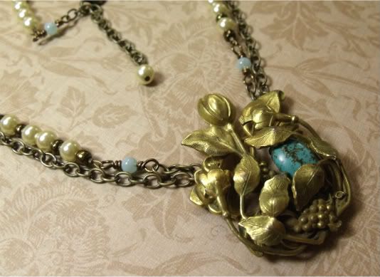
When I got this antique dress clip, the brass was so rich, I wanted to keep it the main focus. To further emphasize it, I needed to find something that would add a touch of contrast. The color wheel tutorial talks about near-complimentary colors:
Near-complementary colors - when a color is paired with the color that appears next to its compelementary color on the color wheel, creating slightly less visual tension. Blue and yellow-orange, for example, are near-complementary colors.
Brass is a yellow-orange metal, therefore blue-green is the perfect color to offset it; I chose turquoise, which is a blue-green stone. Then, in keeping with the idea of a near-monochromatic palette, I chose light golden pearls and light blue-green glass beads (both tints of the focal colors). I also tried to keep the proportions of yellow-to-blue the same throughout the rest of the necklace.
Here are some more jewelry pieces that artisans on etsy made
using monochromatic or near-monochromatic theory:

by doozydoo


by Shannon
----- ----- -----
So now I'd like to challenge you to sit down at your beading table with these theories and techniques in mind and create a piece or two. Or, if you already have, to share them on your blog. Don't forget to leave a comment here so that I know and can check it out!
And, as always, happy beading. <3
----- ----- -----
Wednesday, June 29, 2011
Bead Table Wednesday - Vintage on the Brain
It's Bead Table Wednesday again! This week, I've sure got some pretties for you. For the last week and a half, my bead table has been covered with vintage treasures just waiting to be repurposed into new treasures.
You know we moved recently. You may also remember from this post that the nearest city---though it's not very big---is full of old, old money. A lot of lovely pieces make their way into local antique stores and flea markets here. So you can probably imagine that I've been running around like a kid in a candy shop since we got here, gathering pretties to use! I love the vintage look and, when I can get my little grubbies on the real stuff, boy, I take it.
Lately, I've been particularly drawn to early- and mid-twentieth century faux ivory. Do you remember my faux scrimshaw tutorial? Yeah... it's sorta been a lifelong obsession... Hahaha! Anyway, below are my most recent finds: two carved Bakelite flower pendants, one with its necklace still intact; and a molded floral celluloid dress clip.

They are just so delicate and so beautiful; I love them. Now I've never had these kinds of materials before and had to do quite a bit of research to discover what they are. They're made out of very early plastics, some of the first ever made for the market. How awesome is that? Apparently Bakelite has become very valuable and sought after in recent years, too; not bad for a plastic! (I've just added some links with information on Bakelite and celluloid to my resource page, if you've got a hankering for a closer look.)
At the same antique store, I also found these lovelies: a small box of vintage beads/buttons and a grand piano key. The pendant on the right is a piece that was given to me by the owner of a gallery where I show my work. It is a glass and brass cabochon piece, probably made in the transitional period sometime between the art nouveau and art deco periods in the early part of the twentieth century, although the snake was a very popular symbol in Victorian jewelry as well. I don't know too much about it but it caught her eye and she bought it and gave it to me to make something with. She's the person who first got me into working with repurposed vintage jewelry and components. I consider myself extremely lucky because she basically gave me a shoebox full of stuff and told me to go to town. :D

Again, at the same antique store, I found these vintage Avon lovelies. Meet my new friend, OwlFish!

It's been difficult working up my courage to actually work with some of these beauties, but I've finally overcome some of my fears. When I got the celluloid clip in the first picture, I bought another dress clip, too. It was a French brass filigree clip from the art nouveau period. I'm sorry I didn't get before and after pics, but here is the finished piece I made with it.


You know we moved recently. You may also remember from this post that the nearest city---though it's not very big---is full of old, old money. A lot of lovely pieces make their way into local antique stores and flea markets here. So you can probably imagine that I've been running around like a kid in a candy shop since we got here, gathering pretties to use! I love the vintage look and, when I can get my little grubbies on the real stuff, boy, I take it.
Lately, I've been particularly drawn to early- and mid-twentieth century faux ivory. Do you remember my faux scrimshaw tutorial? Yeah... it's sorta been a lifelong obsession... Hahaha! Anyway, below are my most recent finds: two carved Bakelite flower pendants, one with its necklace still intact; and a molded floral celluloid dress clip.

They are just so delicate and so beautiful; I love them. Now I've never had these kinds of materials before and had to do quite a bit of research to discover what they are. They're made out of very early plastics, some of the first ever made for the market. How awesome is that? Apparently Bakelite has become very valuable and sought after in recent years, too; not bad for a plastic! (I've just added some links with information on Bakelite and celluloid to my resource page, if you've got a hankering for a closer look.)
At the same antique store, I also found these lovelies: a small box of vintage beads/buttons and a grand piano key. The pendant on the right is a piece that was given to me by the owner of a gallery where I show my work. It is a glass and brass cabochon piece, probably made in the transitional period sometime between the art nouveau and art deco periods in the early part of the twentieth century, although the snake was a very popular symbol in Victorian jewelry as well. I don't know too much about it but it caught her eye and she bought it and gave it to me to make something with. She's the person who first got me into working with repurposed vintage jewelry and components. I consider myself extremely lucky because she basically gave me a shoebox full of stuff and told me to go to town. :D


I don't know what I'm going to do with him yet, but whatever it is, it's going to be fun!
It's been difficult working up my courage to actually work with some of these beauties, but I've finally overcome some of my fears. When I got the celluloid clip in the first picture, I bought another dress clip, too. It was a French brass filigree clip from the art nouveau period. I'm sorry I didn't get before and after pics, but here is the finished piece I made with it.

I removed the clip back and folded the prongs down for balance, then used wire to fashion connectors to the back. After a TON of deliberation, I chose the turquoise bead to add because I love the look of brass and blue. :3 Then I used a color technique that I'll talk more about later this week and some antiqued brass chain to build the necklace around the piece. I really, really love the way it turned out.
Anyway! Phew... this post was longer than I thought it was going to be. XD
Please be sure to check out the awesome stuff that everyone else is sharing
for Bead Table Wednesday!
----- ----- -----
Monday, June 27, 2011
Catching Up
Today I'm playing the catch-up game on everything I've missed over the last week and a half. I'd love to take this opportunity to share a bunch of the blogs that I regularly frequent.
My Life Under the Bus
Crystal Clear
Crafty Hope
Miss Val's Creations
M's Place
Therese's Treasures
Pretty Things
The Writing and Art of Andrew Thornton
Such beautiful, talented people in the blog sphere! <3 <3
Although, speaking of blog sphere, has anyone still been experiencing issues with Blogger?
----- ----- -----
My Life Under the Bus
Crystal Clear
Crafty Hope
Miss Val's Creations
M's Place
Therese's Treasures
Pretty Things
The Writing and Art of Andrew Thornton
Such beautiful, talented people in the blog sphere! <3 <3
Although, speaking of blog sphere, has anyone still been experiencing issues with Blogger?
----- ----- -----
Subscribe to:
Posts (Atom)